Have you ever had to build an app with a scroll view of multiple widgets with different heights, and you wanted to add a link so that the user can automatically scroll from one widget to another? One such example could be the table of contents for an article or a menu.
In this post, I will showcase how we can implement this and in order to do so, I am going to use a screen with a few sections and a table of contents at the top of the screen with links to the corresponding sections.
Let’s see how!
This post is based on
Flutter 2.5.2andDart SDK 2.14.3
Solution
To do so, we are going to use Scrollable.ensureVisible within a SingleChildScrollView widget with a Column child.
Briefly, we will create a GlobalKey() for each section. Then we will use this key as the key of the widget that the link will be targeting. Finally, we are going to use this key when we press the link from the table of contents like in the following snippet:
final targetContext = targetKey.currentContext;
if (targetContext != null) {
    Scrollable.ensureVisible(
        targetContext,
        duration: const Duration(milliseconds: 400),
        curve: Curves.easeInOut,
    );
}
As a result, the target widget will get visible after 400 milliseconds.
In the next section, I will try to give a more detailed presentation of the implementation!
Implementation
Prep work
First of all, let’s create a data structure that will represent the section. It will have a key, a title and a body.
class Section {
  final GlobalKey key;
  final String title;
  final String body;

  const Section(this.key, this.title, this.body);
}
The title will be used in the table of contents and the key will be used to scroll to the target section.
Then, we will use this class to generate some dummy data for our example. We can use some lorem ipsum to represent some long text.
const reallyLongBody =
    'Lorem ipsum dolor sit amet, consectetur adipiscing elit. Fusce venenatis pharetra dui, ac semper nulla dapibus ultrices.'
    ' Pellentesque sed erat accumsan lorem rhoncus mattis eu eget nulla. Phasellus sagittis vehicula dapibus. Nulla dolor nunc, '
    'feugiat ac ullamcorper vel, commodo sed lacus. Nunc volutpat rutrum euismod. Nullam venenatis imperdiet odio, non porta leo '
    'ullamcorper ac. Aliquam fringilla mauris ut ante faucibus, non tempus elit placerat. Donec sed porttitor tellus. Donec lobortis '
    'arcu id lectus commodo varius. Fusce tincidunt ante in faucibus suscipit. Nulla facilisi. Nunc at nibh dictum sem aliquet '
    'consectetur eu nec neque. Nullam ullamcorper vulputate nisl quis pharetra. Etiam dapibus ullamcorper magna, a iaculis libero '
    'dignissim in. Vestibulum dictum, justo posuere consectetur eleifend, augue mi dictum dui, eu sollicitudin elit mauris vel lacus. '
    'Donec dui felis, dapibus vel urna at, commodo facilisis felis.\nCurabitur faucibus leo ipsum, in vehicula risus rhoncus id. Donec '
    'ac velit quis nulla suscipit efficitur. Nulla non euismod neque. Sed blandit urna sed ex tempor sagittis. Curabitur condimentum nec '
    'dui quis sollicitudin. Proin consectetur, metus sed rutrum varius, mi augue placerat est, sed posuere risus nunc ac urna. Nam leo '
    'erat, bibendum non nibh sed, sollicitudin aliquet metus. Aliquam finibus turpis vitae leo laoreet molestie.';

final sections = [
  Section(GlobalKey(), '1. Section', reallyLongBody),
  Section(GlobalKey(), '2. Section', reallyLongBody),
  Section(GlobalKey(), '3. Section', reallyLongBody),
  Section(GlobalKey(), '4. Section', reallyLongBody),
  Section(GlobalKey(), '5. Section', reallyLongBody),
  Section(GlobalKey(), '6. Section', reallyLongBody),
];
Widgets
Next, let’s create a widget for the Section, where we are going to show the title and the body of each section
class SectionWidget extends StatelessWidget {
  final Section section;

  const SectionWidget({Key? key, required this.section}) : super(key: key);

  @override
  Widget build(BuildContext context) {
    return Container(
        decoration: const BoxDecoration(
          color: Color(0xfffff8e2),
          borderRadius: BorderRadius.all(Radius.circular(8.0)),
        ),
        margin: const EdgeInsets.symmetric(horizontal: 16, vertical: 8),
        padding: const EdgeInsets.symmetric(horizontal: 16, vertical: 8),
        child: Column(
          crossAxisAlignment: CrossAxisAlignment.stretch,
          children: [
            Text(
              section.title,
              textAlign: TextAlign.center,
              style: Theme.of(context)
                  .textTheme
                  .headline2
                  ?.copyWith(color: Colors.black),
            ),
            const SizedBox(
              height: 36,
            ),
            Text(
              section.body,
              style: Theme.of(context)
                  .textTheme
                  .bodyText1
                  ?.copyWith(color: Colors.black54, height: 1.3),
            )
          ],
        ));
  }
}
After that, let’s create a widget for the link to a section. We will name it SectionLink and we will pass a section and the callback for the onTap event of the InkWell.
class SectionLink extends StatelessWidget {
  final Section section;
  final void Function(Section) onTap;

  const SectionLink({Key? key, required this.section, required this.onTap})
      : super(key: key);

  @override
  Widget build(BuildContext context) {
    return InkWell(
      onTap: () => onTap(section),
      child: Padding(
        padding: const EdgeInsets.all(8.0),
        child: Text(
          section.title,
          style: Theme.of(context)
              .textTheme
              .headline3
              ?.copyWith(color: Colors.black87, fontWeight: FontWeight.bold),
        ),
      ),
    );
  }
}
Next, we are going to add a TableOfContents widget, where we basically iterate on the sections and for each section, we create a SectionLink.
class TableOfContents extends StatelessWidget {
  final List<Section> sections;
  final void Function(Section) onItemTap;

  const TableOfContents({
    Key? key,
    this.sections = const <Section>[],
    required this.onItemTap,
  }) : super(key: key);

  @override
  Widget build(BuildContext context) {
    return Container(
      margin: const EdgeInsets.all(20),
      padding: const EdgeInsets.only(left: 16, top: 24, right: 16, bottom: 10),
      decoration: BoxDecoration(
        color: Colors.white12.withOpacity(0.3),
        borderRadius: const BorderRadius.all(Radius.circular(8.0)),
        border: Border.all(
          width: 2,
          color: Colors.grey,
        ),
      ),
      child: Column(
        crossAxisAlignment: CrossAxisAlignment.stretch,
        children: sections
            .map((e) => SectionLink(section: e, onTap: onItemTap))
            .toList(),
      ),
    );
  }
}
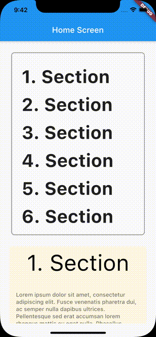
Finally, let’s create ArticlePage where we will tie everything together. In this widget, we will create a SingleChildScrollView with a Column widget containing the TableOfContents and a ListView with the sections.
For the TableOfContents, we are going to pass as parameters the section and the callback for when a section is tapped. This callback contains the logic to scroll to the target widget. First, we verify that there is a widget with this key in the tree, by ensuring that the value of the currentContext is not null. And then, we will pass this context to Scrollable.ensureVisible to scroll to the target widget.
For the ListView, we iterate over the sections and for each one, we create a new SectionWidget using the key from the section as the key for the widget.
class ArticlePage extends StatelessWidget {
  final List<Section> sections;
  const ArticlePage({Key? key, required this.sections}) : super(key: key);

  @override
  Widget build(BuildContext context) {

    final tableOfContents = TableOfContents(
      sections: sections,
      onItemTap: (section) {
        final targetContext = section.key.currentContext;
        if (targetContext != null) {
          Scrollable.ensureVisible(
            targetContext,
            duration: const Duration(milliseconds: 400),
            curve: Curves.easeInOut,
          );
        }
      },
    );

    final listView = ListView.builder(
      shrinkWrap: true,
      physics: const NeverScrollableScrollPhysics(),
      itemCount: sections.length,
      itemBuilder: (BuildContext context, int index) {
        final section = sections[index];

        return SectionWidget(
          key: section.key,
          section: section,
        );
      },
    );

    return Scaffold(
      appBar: AppBar(
        title: const Text('Home Screen'),
      ),
      body: SafeArea(
        child: SingleChildScrollView(
          child: Padding(
            padding: const EdgeInsets.all(8.0),
            child: Column(
              crossAxisAlignment: CrossAxisAlignment.stretch,
              children: [
                tableOfContents,
                listView,
              ],
            ),
          ),
        ),
      ),
    );
  }
}
If you now build and run the app, when you press on a link from the table of contents, you will have the same with the following video behavior.
You can also use dartpad.dev to find and run the code of this post.
More options
Now that we have seen how we can use Scrollable.ensureVisible, let’s explore some more options that we can use to customize the transition to the target widget.
Two of those, which we have seen before in the previous example, are duration and curve. duration can be used to set the desired duration that we want the animation from the link to the target widget to take.
With the curve parameter, we can define the animation curve that the transition will follow. Basically, instead of making the transition at a constant rate, we can set a value to the curve parameter to change the animation over time, either by speeding it up or slowing it down at specific time frames. It can take values like Curves.bounceInOut, Curves.easeInOut, etc. For example, with Curves.easeInOut the animation will start slowly, then speed up and will then end slowly.
Note: A visualization of the different options can be found on api.flutter.dev.
Another parameter of Scrollable.ensureVisible is alignment, and it can be used to set the position of the target widget. If the value is 0.0, the child will be positioned as close to the leading edge of the viewport, 0.5 as close to the center, and 1.0 as close to the trailing edge.
Finally, the last parameter is alignmentPolicy and can be used to decide the policy when applying the alignment parameter. This parameter is of type ScrollPositionAlignmentPolicy, which is an enum with the following options: explicit, keepVisibleAtEnd or keepVisibleAtStart.
When it is set to explicit, it will use the alignment property to decide where to align the target object. If it is set to keepVisibleAtEnd, it will make sure that the bottom of the target item is just visible if the bottom edge of the target item is below the bottom edge of the scroll container. Contrary, keepVisibleAtStart, will make sure that the top of the target object is just visible if the top edge of the target object is above the top edge of the scroll container
Conclusion
And this is it! I hope that you find this post useful and it has given you some insights into how to use Scrollable.ensureVisible and all its options to scroll to a specific widget on a scroll view.
Thanks for reading! If you found this post useful, consider buying me a coffee to support the blog. For questions or comments, feel free to reach out on X!
Until next time!
